Focus as the brand
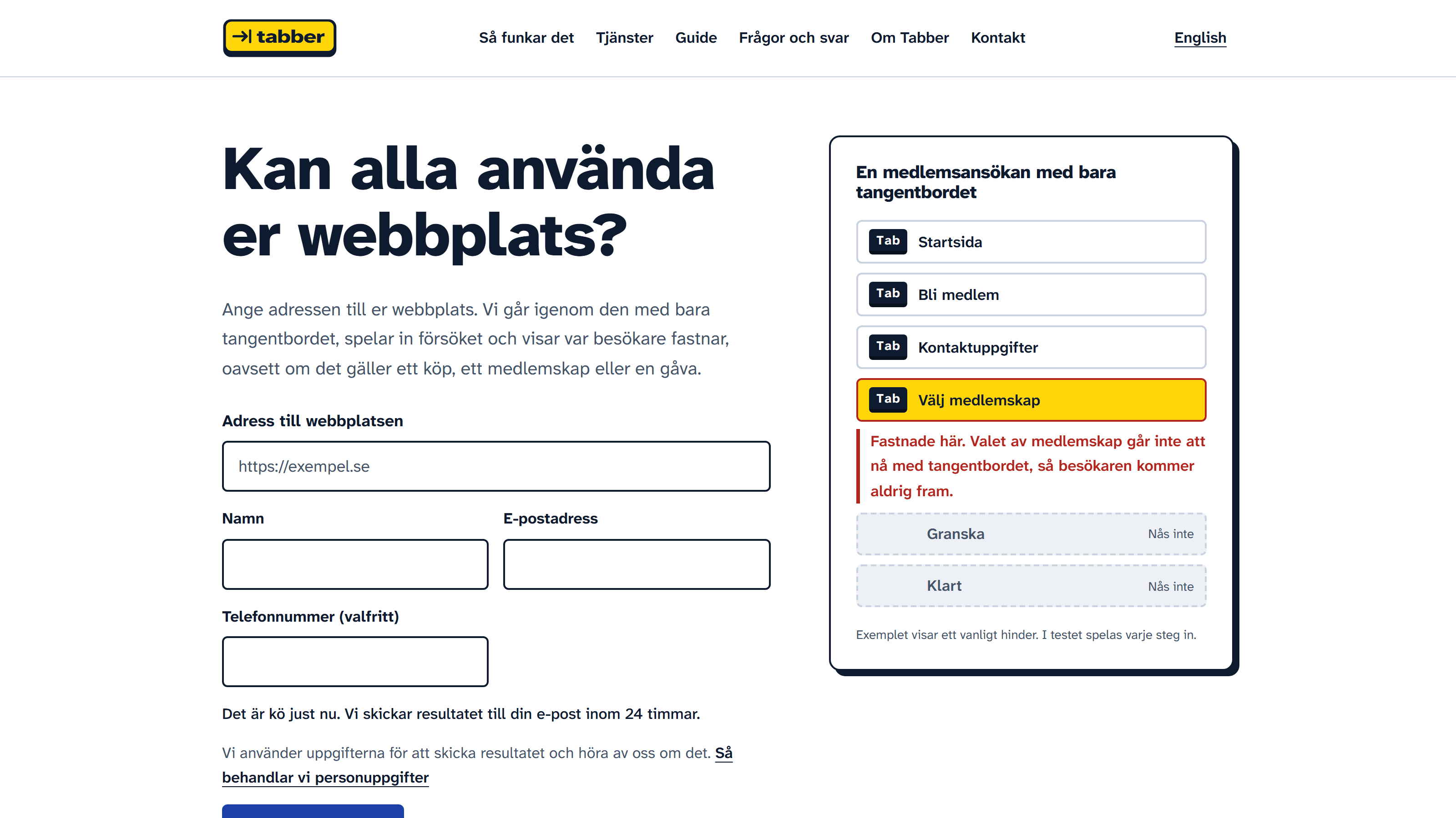
Identity and site for a service that tests Swedish websites with only a keyboard and records where visitors get stuck.
- Company
- Tabber (sister venture)
- Category
- Brand and website
- Industry
- Web accessibility testing
- Year
- 2026
The brief
Tabber tests a website the way a keyboard-only visitor uses it, records the attempt and explains every barrier in Swedish. It sells to web shops, associations and agencies. An accessibility service has to pass its own test, so the brand could not ask for a single exception.
The approach
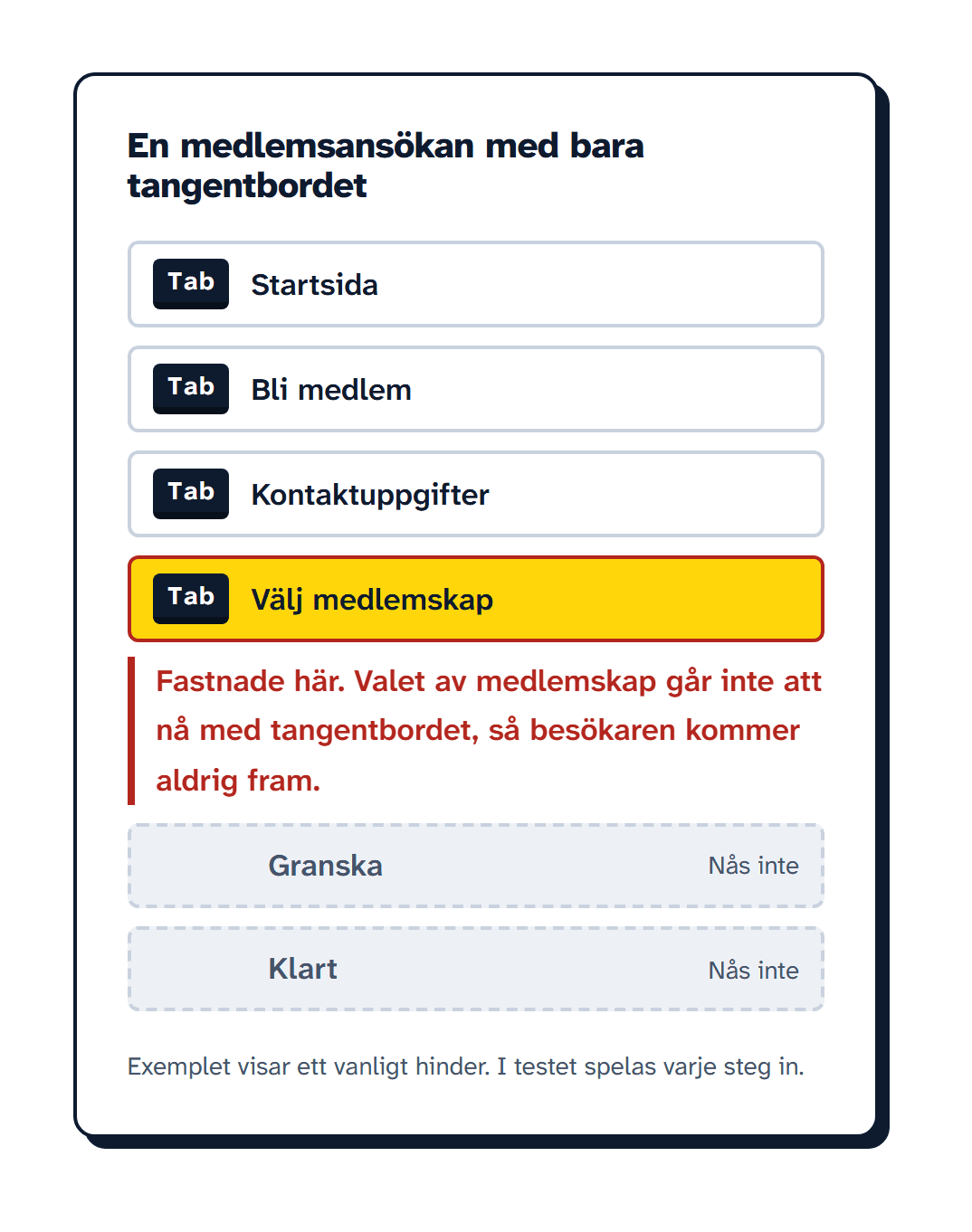
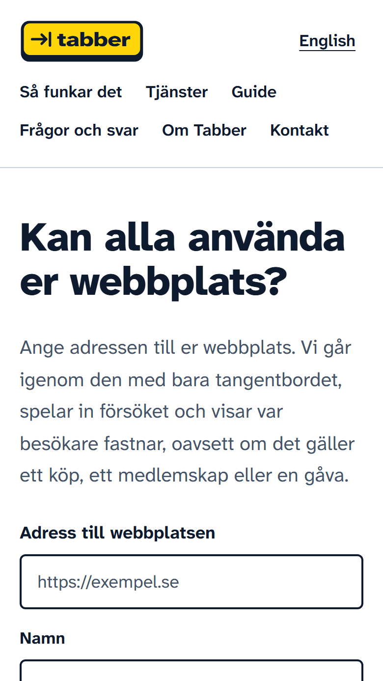
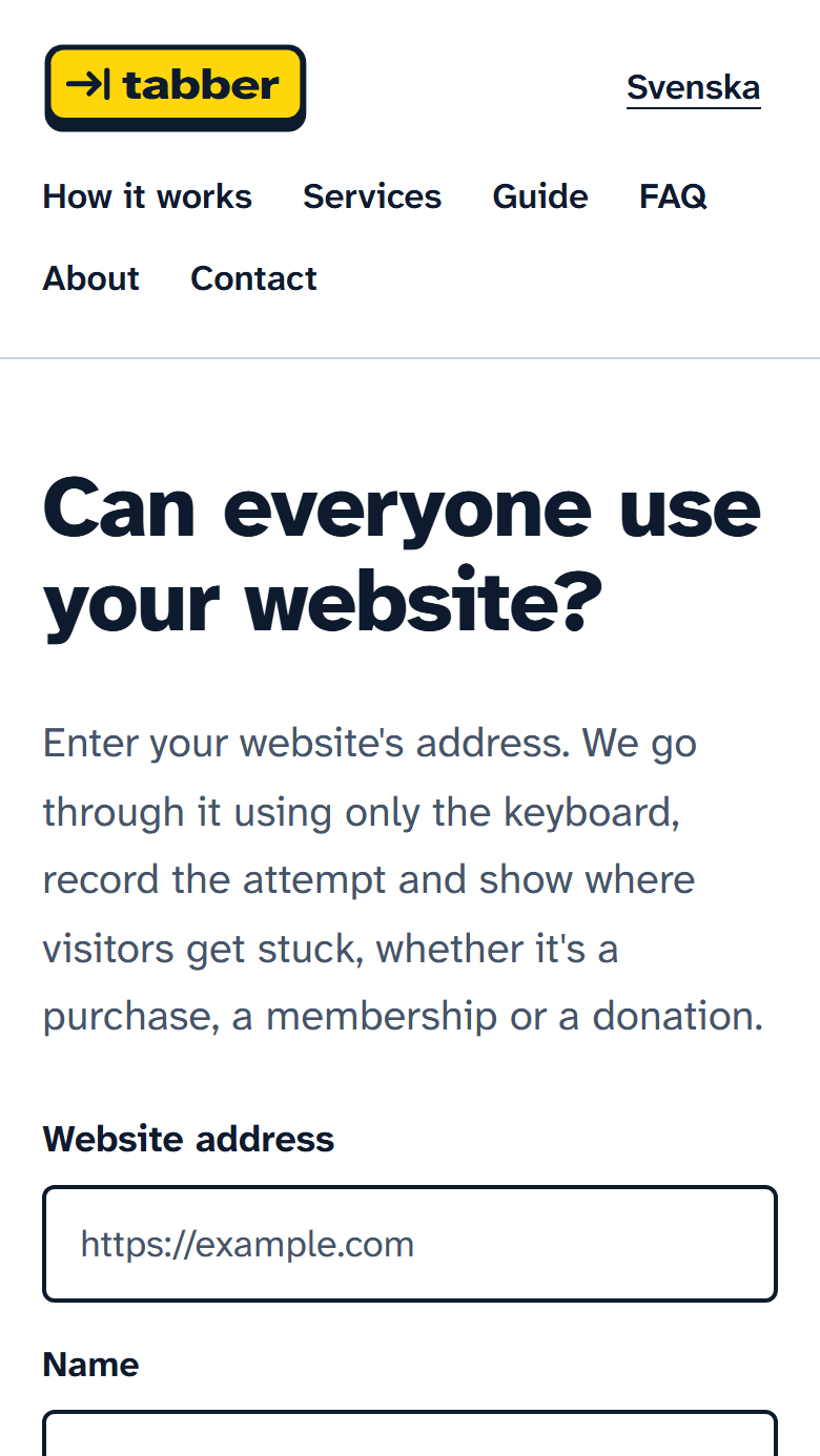
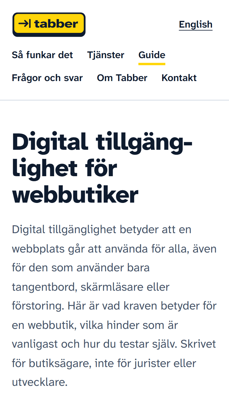
The brand colour is the focus indicator, the yellow halo a keyboard user follows through a page, and the logo is a Tab key. The type is Atkinson Hyperlegible, drawn by the Braille Institute for low-vision readers and self-hosted so visitors' browsers make no third-party font requests. The hero is the product in miniature: a highlight tabs through a membership application and stops where the visitor gets stuck. Without motion it shows the final state, and headings hyphenate so long Swedish words never push a phone screen sideways.
The creative
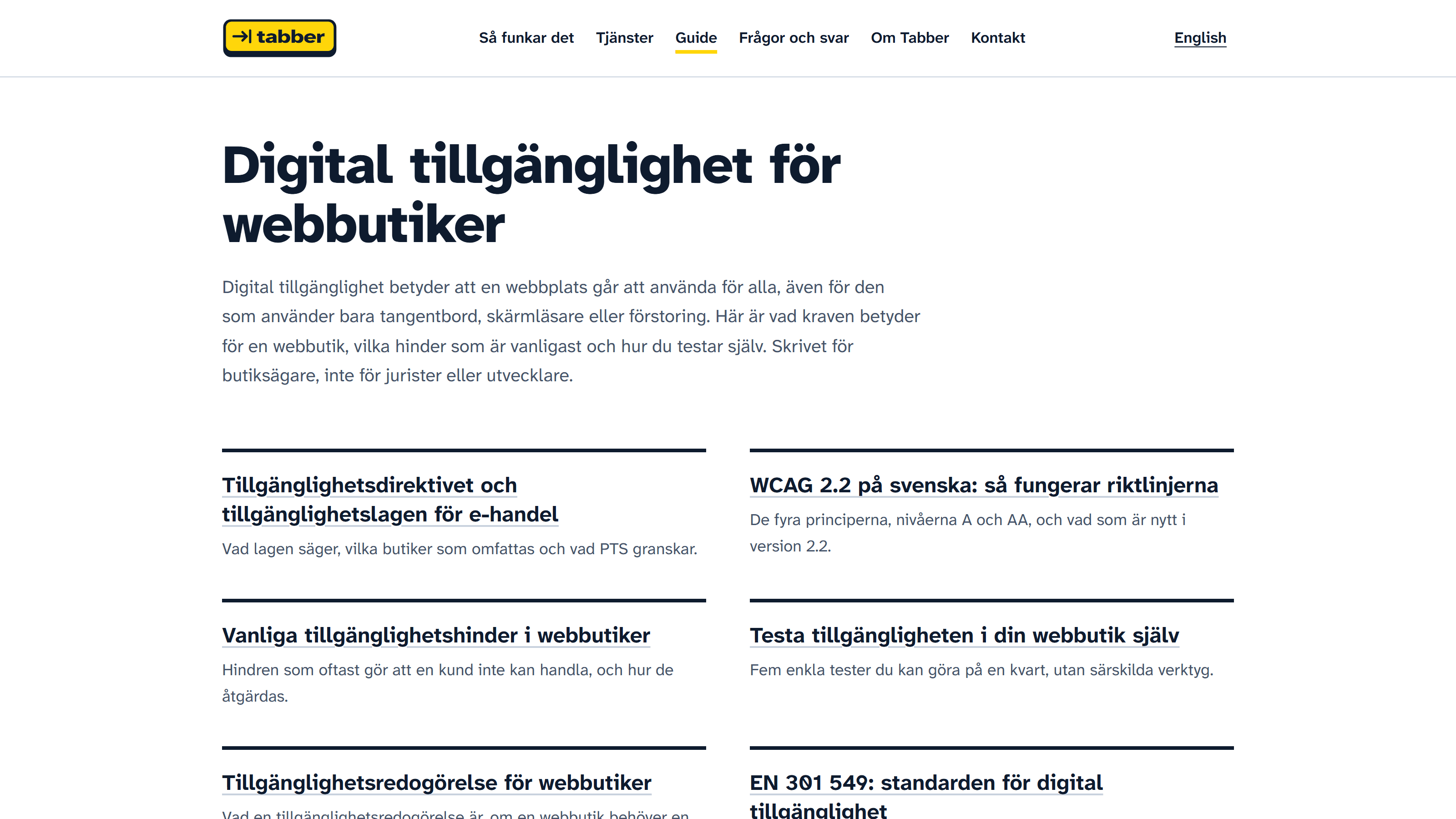
One signal colour
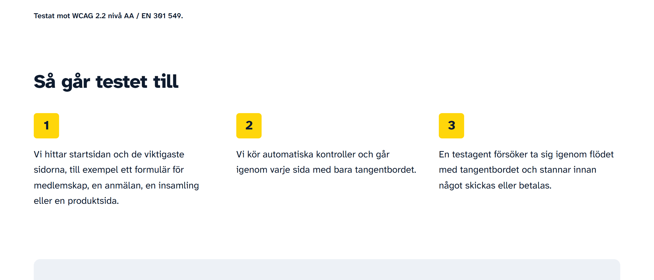
Navy for text, cobalt for actions, yellow only where the keyboard is. The logo, the step numbers and the keyboard path share that yellow, and it is only ever a background behind navy, never text on white.

The result
Sister venture. Tabber has the same founder as HZ Visuals, so there is no client quote here and no performance figures. The site is live at tabber.se.
More work
All projects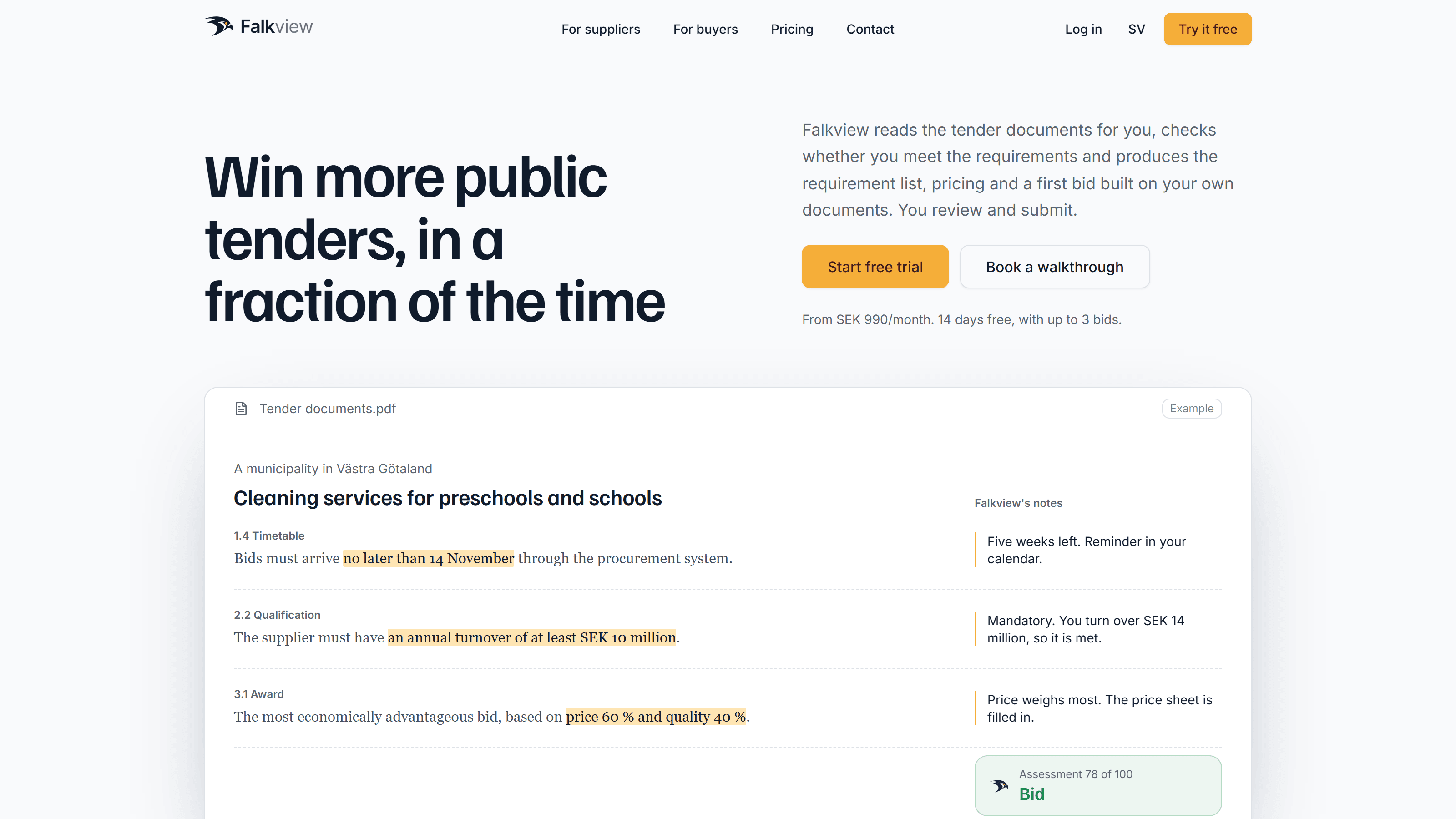
Have something to create?
Tell us what you're launching, selling or promoting. We'll take it from there.
or email hello@hzvisuals.com